What a Retrofit Risk Dashboard actually is
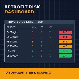
At its core it is a per-object risk score, computed before the retrofit work begins, surfaced in a way the team can prioritize against. Inputs come from three places: the output of the Custom Code AnalyzerThe technical concept that produces the per-object verdict — keep, retrofit, drop, rewrite. Its output is the dashboard's primary input. stage, the runtime telemetry of the source environment, and the dependency graph of the JDE objects being touched. Output is a single value per object — call it 1 to 10, call it green/amber/red — plus the breakdown of what drove it.
The reason a single number matters: a 9-week development window has roughly 70 working days for the dev team. With 350 impacted objects, that is around five hours per object on average, including testing. Such a dashboard tells you which objects deserve a day and which deserve fifteen minutes. Without it, every object gets the same allocation and the dangerous ones get under-tested while the trivial ones get over-engineered.
The dashboard part of the name matters too. It is not a list, it is not a verdict — it is a view the project manager and the lead developer look at every Monday morning and use to decide where the next two weeks of effort go. Static at first, then updated as the retrofit progresses and the assumptions get validated.
Why the discipline emerged at all
Because the alternative — treating retrofit work as a flat list of 350 line items, all weighted equally — has a predictable failure mode. The team starts at the alphabetical top, burns the first six weeks on the easy custom UBEsUniversal Batch Engine — the JDE batch report runner. Custom UBEs are the most numerous and usually the lowest-risk objects in a retrofit estate. in the A and B prefixes, and discovers in week seven that the three custom BSFNsBusiness Functions — compiled C code in the JDE runtime. They sit at the bottom of the dependency graph and break everything when they fail. at the heart of the order entry flow are unworkable in their current form. By then the budget is gone.
The risk dashboard inverts this. The most dangerous objects get worked on first, when the team is fresh and there is still time to escalate. The trivial ones queue up for the back end of the schedule, where a junior developer can clear ten of them in a day. Same total work, completely different outcome at week nine.
This is also why teams with strong PMs gravitate toward the discipline even when no formal artifact exists. They are reconstructing the dashboard in their head, on a whiteboard, in a half-broken spreadsheet — because without it the upgrade ships late or ships broken, and they have seen both.
The three input dimensions of a real risk score
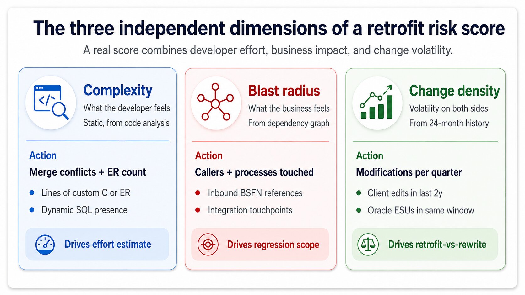
A score with one dimension is a guess. A score with three is a defensible engineering judgement. The three that actually matter are complexity, blast radius, and change density, and a serious risk dashboard computes all three independently before combining them.
Complexity is what the developer feels. Number of merge conflicts predicted by the fingerprint stage, lines of custom code in the object, presence of Event RulesJDE's visual scripting layer attached to forms and applications. Event Rules retrofit is harder than C code retrofit because the diff is visual, not textual. versus straight C, presence of dynamic SQL. A custom BSFN with 40 lines of unchanged C and one renamed variable is complexity 1. A custom application with 200 Event Rules and conflicting Oracle changes in three subforms is complexity 9.
Blast radius is what the business feels. How many other objects depend on this one, how many business processes traverse it, how many integrations call it. A custom UBE that nobody runs has blast radius 1 even if its code is hairy. A custom BSFN called by 47 applications across order entry, manufacturing, and finance has blast radius 9 even if its code is trivially merged. The two dimensions are independent and a good dashboard never collapses them prematurely.
Change density is the volatility signal. How often the source-environment object has been modified in the last 24 months, how many ESUs Oracle has shipped against the standard equivalent in the same window. High change density on both sides means future retrofits get harder, not just this one — the score should reflect the strategic cost of retrofitting versus rewriting against current Oracle.
How runtime telemetry sharpens the score
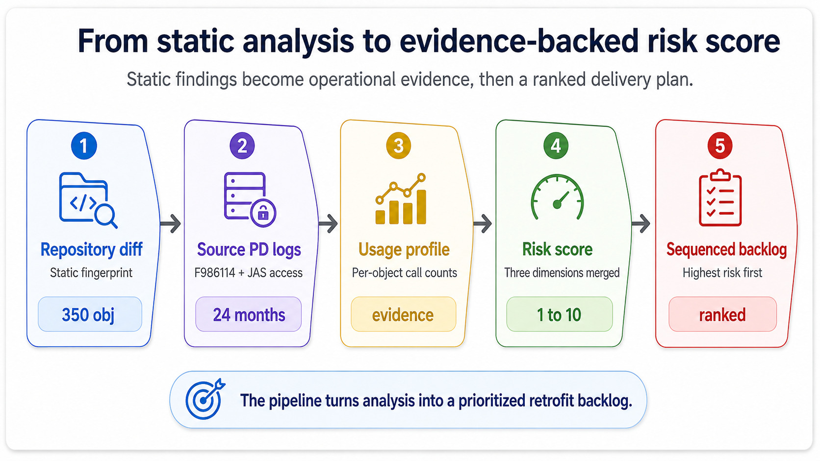
The dimensions above can all be computed statically, from the repository and the change history. The risk dashboard becomes useful — and not just an academic exercise — when you fold in runtime data from the source environment.
The source PDProduction environment in JDE — the live environment. PD execution logs are the ground truth for what objects actually get used and how often. environment knows things the static analysis does not. It knows which custom UBEs ran zero times in the last quarter (drop them), which custom BSFNs were called 11 million times (test them harder), which custom applications had error logs cluster around them in the weeks before go-live planning started. Pull the execution counts out of F986114JDE's job control table. It records every UBE submission and is the canonical source for batch execution telemetry on the source environment. for the batch side and out of the JAS access logs for the interactive side, and you have a usage profile that turns "blast radius" from an estimate into evidence.
This is the move that turns the dashboard from a static spreadsheet into something the project manager actually trusts. A green score backed by zero executions is honest. A green score that ignores 11 million calls is a project waiting to fail at cutover.
What the dashboard looks like at the artifact level
The physical form varies — some teams use a Confluence page, some use a Power BI report against a SQL extract, the disciplined ones use a flat CSV that anyone can grep on. The form is irrelevant. What matters is that for every one of the 350 impacted objects you can answer four questions in under a minute.
What is the score, and what drove it. Who owns this object during the retrofit. What is the planned effort and the planned regression scope. What is the current state — not started, in development, in test, signed off. If the dashboard cannot answer those four questions for any object on demand, it is not a risk dashboard at all, it is a list. The distinction is not pedantic: lists do not change behavior, dashboards do.
The other artifact-level requirement is that the dashboard updates. A retrofit estimate written in week zero will be wrong by week three — some objects will turn out harder, others trivial — and the dashboard needs to absorb the corrections without ceremony. Teams that treat the initial scoring as gospel ship late. Teams that treat it as a hypothesis under continuous revision ship on time.
Where the dashboard plugs into the rest of the upgrade
It feeds two downstream consumers. The development team uses it to sequence work, picking up the highest-score objects in week one and saving the trivial ones for the schedule's tail. The test team uses it to scope regression: high-blast-radius objects pull in more business processes for regression coverage, low-blast-radius objects can be covered by automated smoke tests alone.
The third consumer is the steering committee, and this is where most teams undersell the artifact. The dashboard, rolled up to a single distribution chart, tells the CIO whether the retrofit is going to land in scope or not — long before the development team would surface that information through normal status reporting. A dashboard skewed red is a budget conversation in week two, not a fire drill in week eight. That early signal is the second most valuable output of the discipline, after the day-to-day prioritization.
Upstream, the dashboard depends entirely on the smart-filter and fingerprint stages having produced clean output. Garbage in, useless dashboard out. This is why the discipline never lives in isolation — it is the third stage of a four-stage pipeline, and skipping the upstream work to jump straight to scoring produces numbers nobody trusts.
What this means for your upgrade scope
If the partner running your retrofit cannot show you a risk-scored backlog or a defensible equivalent in week one of development, you have a problem you do not yet know about. The artifact does not have to carry that name — synonyms like retrofit triage matrix, impact-weighted backlog, and risk-scored work order describe the same discipline — but the three input dimensions and the four artifact-level questions are non-negotiable.
Ask to see it. Ask which objects scored highest and why. Ask how runtime telemetry from your source environment was incorporated. If the answers are vague, the team is going to discover the dangerous objects the slow way, on your time. The cost of that discovery, on a typical 9.1 to 9.2 estate, lands somewhere between three and six extra weeks of development plus a noticeable hit to the regression test pass.
If you want a second opinion on whether your current retrofit plan has the scoring and prioritization backbone it needs, book a free consultation. We will walk through the dimensions on your specific estate, look at where the runtime telemetry lives in your source environment, and tell you honestly whether the work in front of you is correctly weighted — or whether the project is one bad week from a budget conversation.